Theme and custom CSS
- Last verified
- Last verified Aug 29, 2026
Use theme settings to make the online shop match your brand while keeping checkout readable and reliable. Use custom CSS only when theme controls cannot express the required change.
This article is for organizers and technical staff who maintain the customer-facing shop.
Before you start
Prepare:
- logo and favicon files
- brand colors for buttons, text, backgrounds, and alerts
- font requirements
- examples of pages or checkout states that must be checked
- approval from the team responsible for legal, analytics, and checkout behavior when snippets are involved
Open the theme editor
In the back office, open Shops, select the shop, and open Theme.
Use theme controls for colors, typography, spacing, borders, button styles, semantic colors, media, and contrast checks.
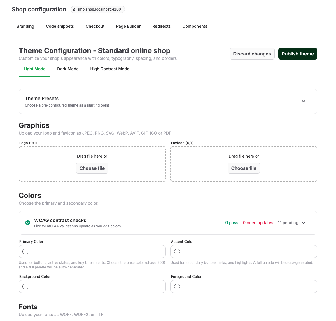
Use theme settings first
| Area | What to check |
|---|---|
| Brand assets | Logo and favicon are current, readable, and not distorted. |
| Colors | Text, surfaces, buttons, borders, alerts, and links have enough contrast. |
| Typography | Fonts are readable on mobile and support the shop languages. |
| Spacing and borders | Cards, forms, and checkout controls remain easy to scan. |
| Semantic colors | Error, warning, success, and informational states remain distinct. |
| Preview | Check light, dark, or high-contrast modes when available. |
Publish the theme only after reviewing the shop home page, offer detail page, cart, checkout, and payment or confirmation state.
Check accessible input colors
The WCAG contrast checks update while you edit each light, dark, or high-contrast mode. Effective input text and placeholder text must each reach 4.5:1 against the input fill. For every configured background, surface, and elevated surface beside a field, either the input fill or its visible border must identify the field at 3:1. The 2-pixel keyboard-focus outline must reach 3:1 against each of those surrounding surfaces. For unselected checkboxes and radio buttons, either the unselected fill or its visible border must identify the control at 3:1 against every color where it can appear, including the input-fill surface. For selected controls, the checkmark or dot must reach 3:1 against the selected fill, and either the selected fill or its visible border must identify the control at 3:1 against those same adjacent colors.
The online shop derives dedicated accessible input and selection colors from your existing text, surface, border, and primary colors. A configured color is kept when it already meets WCAG AA. Otherwise, the shop adjusts the effective input or selected-control color toward black or white by the smallest practical amount. This adjustment affects standardized input fields, checkboxes, and radio buttons; it does not replace the color saved in the theme editor or change the same brand color elsewhere.
Draft changes continue to save while checks are failing. Publish theme is disabled when a configured mode has a definite WCAG AA contrast failure. Open the failed check, update the highlighted color controls, and confirm that all configured modes pass before publishing. Checks marked as pending because optional colors are empty do not block publishing; the shop uses its accessible fallback colors for those inputs. If another editor or auto-save changes the saved draft during publishing, the server checks that latest draft and blocks an inaccessible result. The editor then reloads the latest draft and points you back to the failed checks; if it cannot reload, reload the page before correcting the colors.
Use snippets carefully
Open Code snippets only when you need approved custom CSS, analytics tags, consent-manager code, trusted-shop badges, or partner scripts.
Use Add custom CSS for small styling adjustments. Use Add HTML/JavaScript snippet only for scripts that have been approved and tested.
Use the supported CSS contract
When theme controls are not sufficient, use the online shop CSS reference. It is generated from the shop's tested customization contract.
Use the contract in this order:
- Override a supported token such as
--color-btn-primary-bg,--color-text-body, or--radius-lg. - If a token cannot express the change, scope the rule with a stable
data-shop-*hook. - Test the affected page and the complete checkout in every supported theme mode and viewport.
For example:
:root {
  --color-btn-primary-bg: #0057b8;
}

[data-shop-section="header"] {
  box-shadow: 0 2px 8px rgb(0 0 0 / 12%);
}

[data-shop-shell="checkout"] [data-shop-component="request-item-card"] {
  border-radius: var(--radius-lg);
}
Do not build maintained customizations on data-route-id, Tailwind utility classes, DOM ancestry such as :nth-child, generated IDs, data-block-id, or unlisted private attributes. These are implementation details and can change without notice. Only the tokens and data-shop-* hooks in the generated reference are supported customization points.
Safe custom CSS checklist
Before publishing CSS:
- scope selectors to the intended shop area
- avoid hiding required form labels, payment controls, or legal checkboxes
- test desktop and mobile
- test long event names, sold-out states, error messages, and required fields
- keep a record of what the CSS changes and who owns it
- remove obsolete CSS after theme settings can replace it
Expected result
The shop reflects the organizer's brand, remains readable on mobile and desktop, and lets customers complete checkout without layout, contrast, consent, or payment issues.
Troubleshooting
| Problem | What to check |
|---|---|
| Text is hard to read | Theme color contrast, semantic colors, custom CSS overrides, and image backgrounds. |
| Checkout layout looks broken | Recent snippets, long labels, mobile width, required fields, legal checkboxes, and payment provider frames. |
| Theme changes are not visible | Unpublished draft state, browser cache, shop domain, and whether you are viewing the correct shop. |
| Analytics or consent stopped working | Snippet order, consent manager settings, blocked scripts, and checkout-page restrictions. |
| A custom style affected another page | Selector scope, shared components, page builder blocks, and inherited CSS. |